

Can Wallpaper Change the Perceived Distance Between Objects in a Room?
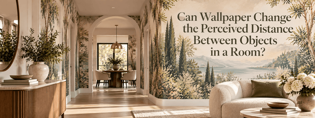
A room can have exactly the same dimensions and furniture placement, yet feel completely different depending on what happens on its walls.
One of the more subtle reasons is perception.
Wallpaper does not physically move a sofa away from a wall, make a window larger, or change the distance between two pieces of furniture. But through pattern, scale, color, contrast, rhythm, and visual direction, it can change how the eye interprets those distances.
A wall can appear closer or farther away. Furniture can feel more separated or more connected. A ceiling can seem higher. Two architectural elements can appear visually closer together—or further apart.
This is where wallpaper becomes more than decoration.
It becomes a tool for manipulating perceived space.
The Eye Does Not Measure a Room Like a Ruler
When we enter a room, we do not consciously calculate every distance.
Instead, the brain interprets visual information and builds an impression of space.
Color, contrast, pattern, perspective, shadows, repetition, and scale all contribute to that interpretation.
This means that the perceived distance between objects is not always the same as their physical distance.
For example, a strongly contrasting wall behind a sofa can make the sofa appear more visually anchored to that wall. A low-contrast wallpaper can make the same sofa feel less separated from its background.
Neither situation changes the actual position of the furniture.
The visual relationship changes.
That distinction is extremely useful when designing interiors.
Can Wallpaper Make a Wall Feel Closer?
Yes.
Dark, saturated, or highly contrasting wallpaper can make a wall feel visually stronger and more present.
This can create the impression that the wall is closer to the viewer.
That does not automatically make a room feel smaller.
In the right context, bringing a wall visually forward can make a large, empty room feel more balanced and intimate.
Consider a long living room where the far wall feels distant and disconnected from the rest of the space. A deeper wallpaper color or a substantial pattern can give that wall greater visual weight.
Instead of feeling like an empty endpoint, it becomes part of the room.
This can make the overall space feel more intentional and proportionate.
Can Wallpaper Make a Wall Feel Farther Away?
It can also work in the opposite direction.
Lighter colors, softer contrast, restrained patterns, and atmospheric designs can reduce the visual weight of a wall.
When a wall recedes visually, the room can feel more open.
This is particularly useful when the goal is to create an impression of greater spaciousness without relying entirely on mirrors or furniture changes.
Soft, low-contrast wallpaper can create continuity across a wall rather than emphasizing its boundaries.
Instead of saying, “Here is the wall,” the surface becomes part of the overall atmosphere.
That subtlety can make the room feel deeper.
Pattern Direction Can Change Perceived Distance
The direction of a pattern can influence how the eye moves across a room.
Vertical lines and elongated motifs encourage the eye upward.
Horizontal patterns can encourage lateral movement.
Large-scale designs can create stronger visual landmarks, while smaller, more repetitive motifs can create a continuous surface.
This matters because the eye follows visual pathways.
A pattern that moves horizontally across a wall may visually connect objects positioned along that direction.
A vertically oriented design can create stronger relationships between the floor, furniture, and ceiling.
Wallpaper therefore does not simply occupy a surface.
It can influence the direction in which the room is visually experienced.
Scale Changes the Relationship Between Wallpaper and Furniture
Pattern scale is one of the most powerful variables.
Imagine a large sofa positioned against a wall covered in a tiny, repetitive pattern.
The furniture may appear especially substantial because the pattern provides a fine-grained background.
Now place the same sofa against a large-scale pattern.
The relationship changes.
The sofa may appear more integrated into the wall because both have greater visual weight.
Neither the sofa nor the wall has changed physically.
The perceived proportion between them has.
This is why wallpaper should be selected in relation to the furniture it will sit behind.
A pattern should not simply look good by itself.
It should make sense next to the objects around it.
Contrast Can Pull Objects Together—or Separate Them
Contrast creates visual boundaries.
A high-contrast wallpaper behind a piece of furniture can clearly separate the furniture from the wall.
This can make the object appear more distinct and prominent.
Low-contrast wallpaper can have the opposite effect.
When the colors and values are closer together, the furniture and wall can visually blend.
This can make the room feel softer and more continuous.
Neither approach is inherently better.
The question is what relationship you want to create.
If you want a sculptural chair to stand out, stronger contrast may help.
If you want a large cabinet to feel less visually heavy, a lower-contrast wallcovering can allow it to blend more naturally into the background.
Wallpaper Can Change How Close Furniture Feels to the Wall
Furniture placement is another area where perception becomes important.
A sofa placed close to a wall can sometimes feel as though it is visually attached to it.
A wallpaper with strong horizontal movement behind the sofa may reinforce that relationship.
A more atmospheric, low-contrast design can make the wall feel less visually defined, allowing the furniture to appear more independent.
Texture also matters.
Embossed or dimensional wallpaper creates shadows and highlights that add another layer between the object and the wall.
This can make the surface feel deeper.
The physical gap has not changed, but the visual experience of that gap has.
Repetition Can Create Visual Distance
Repeated motifs can establish rhythm.
When a pattern repeats across a wall, the eye begins to understand the surface as a continuous field.
This can create interesting relationships between objects.
For example, a repeated geometric pattern behind two separate chairs can visually connect them even if there is physical space between them.
The chairs remain separate objects, but the shared background gives them a visual relationship.
In another room, a pattern with strong directional movement can make objects appear to participate in the same visual sequence.
Wallpaper can therefore either emphasize separation or create connection.
Can Wallpaper Make a Room Feel Wider?
It can contribute to that perception.
Wallpaper does not literally increase the width of a room, but certain visual characteristics can encourage the eye to move laterally.
Broad horizontal patterns, elongated motifs, and continuous low-contrast designs can reduce the feeling of abrupt visual boundaries.
This can make the room feel more expansive.
However, there is an important distinction between making a room feel wider and simply making the pattern itself horizontal.
A horizontal stripe is not automatically the best solution.
The entire composition matters.
Furniture placement, ceiling height, window position, lighting, and surrounding colors all influence how the wallpaper is perceived.
Can Wallpaper Make a Room Feel Taller?
The same principle works vertically.
Elongated vertical patterns can encourage upward eye movement.
This can strengthen the visual connection between the floor and ceiling and make the vertical dimension feel more prominent.
Tall architectural elements can become even more noticeable when paired with wallpaper that reinforces their direction.
This can be particularly effective in rooms with:
-
Low ceilings
-
Tall windows
-
Narrow walls
-
Vertical cabinetry
-
Tall doorways
-
Long architectural features
The goal is not to trick the eye with an obvious optical illusion.
The goal is to reinforce the dimension the room already possesses.
Wallpaper Can Change the Perceived Relationship Between Two Objects
This is perhaps the most interesting application.
Imagine two pieces of furniture separated by three feet.
A wallpaper pattern that visually connects the space between them can make them feel like part of one composition.
A highly contrasting pattern that creates a strong visual interruption can emphasize the separation.
The same principle applies to architectural features.
Two windows can appear more connected when surrounded by a continuous pattern.
Two separate wall niches can feel like part of one architectural rhythm.
Artwork and furniture can appear closer in relationship when the wallpaper creates a shared visual field behind them.
In other words, wallpaper can influence not only the distance between objects, but the relationship we perceive between them.
Color Temperature Can Affect Visual Depth
Warm and cool colors can also influence spatial perception.
Cooler colors are often associated with visual recession, particularly when they are soft and low in contrast.
Warmer or more saturated colors can appear more immediate.
This does not mean that every blue wallpaper will make a room larger or every warm wallpaper will make it smaller.
Context is critical.
A deep blue wall in a dramatic interior may feel intimate and close. A pale blue-gray surface with little contrast may feel airy and distant.
The effect comes from the combination of hue, saturation, brightness, pattern, lighting, and surrounding materials.
Texture Adds Another Layer of Distance
Texture introduces physical-looking depth to a surface.
Subtle embossing can create highlights and shadows that make a wall feel dimensional.
This can be especially effective when the room already contains tactile materials such as:
-
Natural stone
-
Wood
-
Linen
-
Bouclé
-
Velvet
-
Brushed metal
A textured wallpaper can create a transition between the flat architectural plane and the three-dimensional objects in front of it.
This makes the wall feel less like a background and more like another material within the room.
Negative Space Is Just as Important
One of the easiest ways to disrupt perceived distance is to fill every available surface.
When wallpaper is paired with too many objects, artwork, accessories, and competing patterns, the eye has difficulty establishing relationships.
The room becomes visually dense.
Negative space gives the eye somewhere to pause.
A quieter section of wallpaper can make a nearby object feel more prominent. A large area of restrained pattern can give a sculptural piece of furniture room to breathe.
This is why visual spaciousness is not necessarily about having fewer square meters.
It is often about having fewer competing signals.
The Same Wallpaper Can Behave Differently in Different Rooms
A wallpaper should never be evaluated independently of its environment.
The same design may make one room feel deeper and another feel more enclosed.
Why?
Because perception depends on context.
A large-scale pattern may feel sophisticated in a spacious living room but overwhelming in a narrow hallway.
A dark textured wallpaper may make a large dining room feel intimate while making a very small room feel more enclosed.
A light, subtle design may open up a compact bedroom but feel too quiet in a large open-plan interior.
There is no universal wallpaper formula.
The room itself determines how the wallpaper behaves.
How to Use Wallpaper to Control Perceived Space
Before choosing a design, identify what you want the room to feel like.
If you want a wall to feel more distant:
Consider lighter tones, lower contrast, softer patterns, and atmospheric designs.
If you want a wall to feel more present:
Consider deeper colors, stronger contrast, richer texture, or larger-scale pattern.
If you want to emphasize width:
Look for visual movement that travels horizontally across the surface.
If you want to emphasize height:
Consider vertical rhythm, elongated motifs, or patterns that draw the eye upward.
If you want furniture to stand out:
Use contrast between the wallpaper and the furniture.
If you want furniture to feel more integrated:
Choose wallpaper with related tones, textures, or visual weight.
If you want separate objects to feel connected:
Use a continuous pattern or color relationship that creates a shared background.
The important thing is to choose wallpaper according to the spatial effect you want—not simply according to whether you like the pattern.
A Designer's Way to Test the Effect
Before committing to a wallpaper, stand at the main entrance to the room.
Look at the walls and furniture as a complete composition.
Then ask:
What feels closest?
What feels farthest away?
Which objects feel connected?
Which ones feel isolated?
Does the wallpaper strengthen or weaken those relationships?
Then imagine the room with a different wallpaper.
Would the sofa feel more prominent?
Would the far wall feel closer?
Would the windows feel connected?
Would the room feel taller, wider, softer, or more intimate?
These questions reveal something that a simple color-matching exercise cannot.
Wallpaper is not only about what the wall looks like.
It is about how the entire room is perceived.
Final Thoughts
Wallpaper cannot physically change the distance between objects in a room—but it can change how those distances are experienced.
Pattern direction can guide the eye. Scale can alter proportion. Contrast can separate or connect objects. Color can influence visual depth. Texture can add dimensionality. Repetition can establish relationships. Negative space can make those relationships easier to read.
The most effective wallpaper choices therefore do more than decorate a wall.
They shape the way the room is visually organized.
When selected with architecture, furniture, lighting, and proportion in mind, wallpaper can make a wall feel closer or farther away, make objects feel more connected or distinct, and subtly change the perceived dimensions of an interior.
That is one of the most powerful qualities of well-designed wallcovering: the ability to change not the physical space itself, but the way we experience it.